Reimagining UTD’s eLearning Experience
A cleaner, faster way for students to check grades and deadlines.

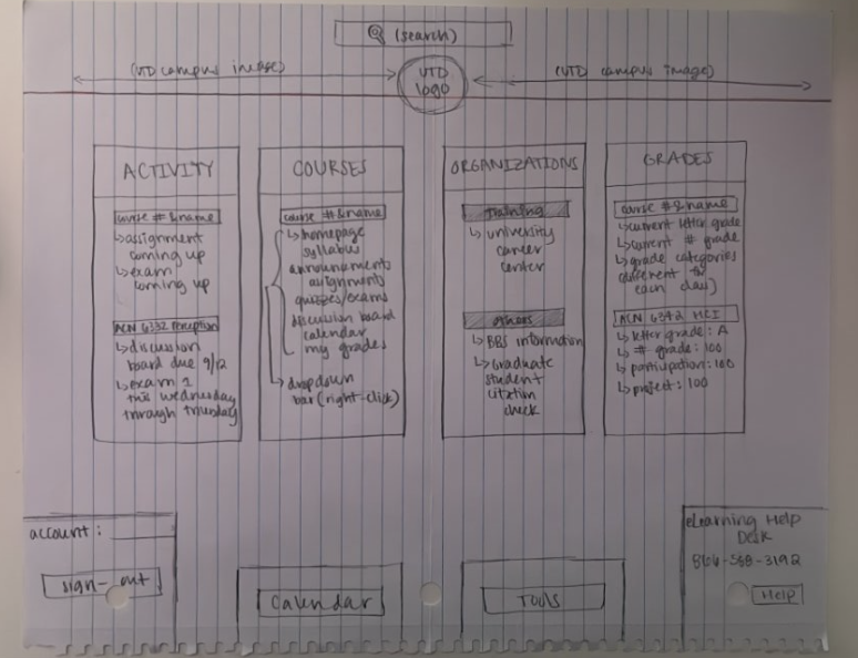
Before (original eLearning)
Key tasks like checking grades and due dates are buried behind outdated, irrelevant screens and extra navigation steps.

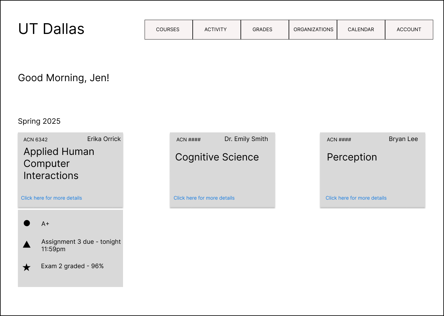
After (Redesigned eLearning)

Simplified UI and navigation to reduce noise and glanceable “Quick View” buttons bring grades, deadlines, and other important announcements to the forefront.
TL;DR - Project Snapshot
For: UTD students using eLearning to check grades, due dates, and feedback.
Problem: Key tasks (view grades, see what’s due, read feedback) are buried behind irrelevant screens, inconsistent interactions, and extra navigation.
Goal: Redesign the view grades flow so progress and deadlines are glanceable and actionable in ≤ a few clicks/taps.
What we did: Heuristic review → 1 round of formative usability testing on lo-fi wireframes → synthesized findings → built a hi-fi prototype addressing those issues.
Outcome: A coherent, modern redesign that reduces clicks to grades and elevates due dates & feedback; desktop-first with selective mobile to confirm responsiveness.
My role: Sole product designer (lo-fi → hi-fi in Figma); co-led research with one teammate.
Projected Impact: Lower support burden, higher student satisfaction, stronger stickiness vs. Canvas.
Limitations: Time-boxed scope—single lo-fi study (small N), no post-hi-fi validation yet.
Timeline: Feb–Jun 2025
Team: 2 researchers; 1 designer (me)
Platform: Desktop + Mobile
Tools: Figma, Figma Make, Google Forms, Google Sheets, MURAL, ChatGPT, Claude, Perplexity
Problem Statement
UTD students use eLearning (Blackboard) throughout their day to check grades, due dates, assignments, and more, yet the current experience buries these tasks behind irrelevant screens, inconsistent interactions, extra navigation, and an overall outdated interface. This causes students to struggle with quickly finding grades, due dates, and assignment details, which increases confusion and engagement with the LMS. The goal was to redesign a key flow, viewing student grades, to make progress and deadlines glanceable and actionable in under a few clicks/taps, reducing confusion for students and support burden for the IT department.
Goals
Context: eLearning (Blackboard) is used daily by UTD students for course content, assignments, and grades.
User goals:
See current grades and breakdown fast (per course + across courses)
Spot due dates and assignments without deep navigation
Understand progress at a glance
Business goals:
Lower confusion/support requests
Improve perceived usability vs. competing LMS (e.g., Canvas)
Increase engagement & retention with clearer IA and mobile usability
Research Plan & Methods
Scope note: We outlined a broader field-research plan (interviews/observation/survey), but due to time constraints we did not run field studies. Instead, we executed a heuristic evaluation, task analysis, and one round of formative usability testing on lo-fi wireframes to inform the high-fidelity redesign.
The following few questions from the research plan helped guide us in the redesign:
What are the most used task flows?
Where do students get stuck (grades, due dates, feedback)?
What does an ideal experience look like for a student?
Heuristic Evaluation
We ran a heuristic evaluation of the grades flow on desktop using Nielsen’s heuristics to diagnose why students struggle to find grades and due dates. We prioritized issues by severity, frequency, and direct impact on the ‘View Grades’ task. The four findings below drove the core redesign decisions.
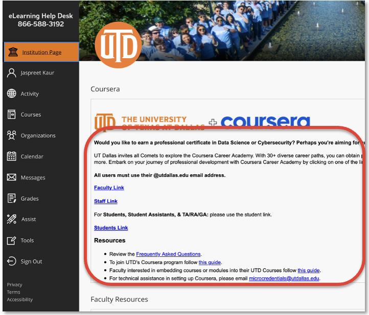
1) Irrelevant info on homepage (default isn’t Courses)
Heuristic: Aesthetic & Minimalist; Match to Real World
Issue: Students open eLearning to check grades/due dates; showing institution/news first adds friction and confuses intent.
Design recommendation: Default to Courses at entry; surface “Quick View” on the first screen for each course, giving students a glance at assignments, announcements, grades, and more.
Expected impact: ↓ time-to-first-grade; ↓ click-depth; ↑ perceived clarity (SEQ).
3) Unclear & inconsistent due dates
Heuristic: Visibility of System Status; Consistency & Standards
Issue: Deadlines are action drivers; low contrast or missing dates lead to missed/late work.
Design recommendation: Elevated due-date styling (typographic scale + icon + chip), standardized date format, and clear “N/A” where not applicable.
Expected impact: ↓ missed work; ↓ scanning time; ↑ confidence/trust.
2) Inconsistent item links (some rows clickable, some not)
Heuristic: Consistency & Standards; Recognition over Recall
Issue: Mixed affordances make students guess where to click, causing hesitation and backtracks.
Design recommendation: Uniform clickable rows/cards with explicit hover/tap states and accessible focus.
Expected impact: ↓ misclicks/backtracks; ↑ task success; ↑ SEQ.
4) No error prevention for missed deadlines
Heuristic: Error Prevention; Visibility of System Status
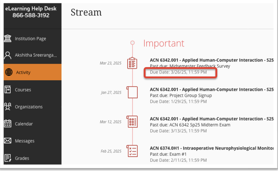
Issue: Without proactive alerts, students only discover risks by manually checking an “Activity” page, which is not clearly evident as the place a student should check for upcoming deadlines.
Design recommendation: Multi-surface visibility: due dates appear in (a) home → course quick-view popup, (b) course page assignment tile, and (c) per-course Grades page, with consistent icon/chip styling. Automated alerts for due soon and overdue items would fall under Next Steps.
Expected impact: ↓ missed deadlines; ↓ time spent hunting dates; ↑ sense of control & trust.
Task Analysis (Current State)
To understand where students lose time and context, we mapped the end-to-end “view grades” journeys using the current eLearning platform. We focused on the two highest-frequency intents: (A)access a detailed view of the grades for a single course and (B) get an all-courses snapshot of grades. Each step is annotated with the specific frictions we observed (extra clicks, weak affordances, low-visibility signals, and context loss). This gives a clear baseline for why the redesign choices were necessary.
Log into eLearning LMS
a. Land on default institutions page (non-course content)
Navigate to desired course
a. Click on Courses in left navigation menu
b. Select target course from the list
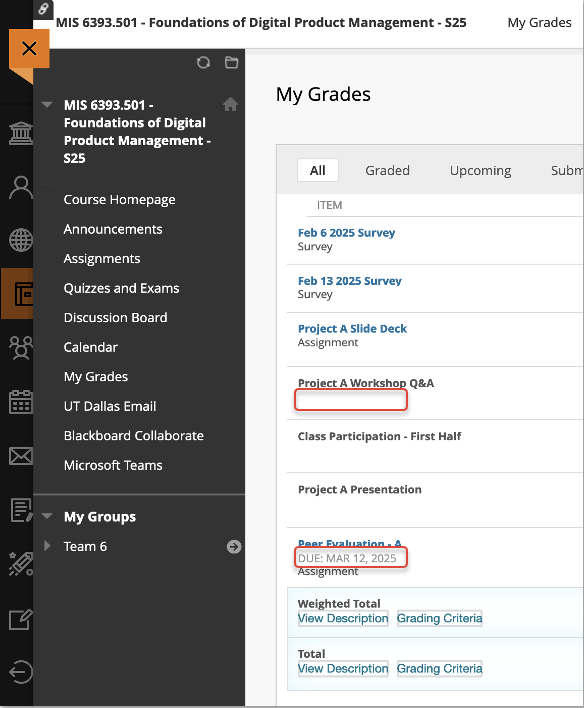
Locate grades for the course
a. Find My Grades in the left course navigation menu (varies by course)
b. Open My Grades
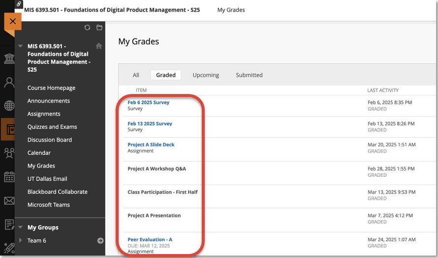
Scan breakdown of graded and upcoming course work
a. Parse items (mixed link behavior)
b. Look for due dates and feedback (inconsistent, low emphasis)
Task A: View grades for a specific course
Points of friction
1a. Extra click (default page is not Courses)
3a. Inconsistency (location/label of grades varies)
4a. Unclear target (some rows clickable, some not)
4b. Low visibility (due dates de-emphasized)
Next Steps…
Uniform clickable rows, clear due dates, weightage, grades, and status chips. Provide actionable links to student, such as instructor contact.
Log into eLearning LMS
a. Land on default institutions page (non-course content)
Navigate to Grades
a. Select Grades from the left navigation menu
Scan each course card for graded work
a. Option to click View all work for a course
Task B: View overall grades for ALL courses
Points of friction
3. Low visibility (grades frequently shown as “-/100”) & Poor feedback (lack of communication to student on their current academic standing in the courses)
Next Steps…
Keep the all courses view, but make it truly glanceable: clear current grade and progress bars for each course to allow students to compare grades across courses.
From the task analysis, three frictions stood out: extra navigation to reach grades, mixed affordances, and hard-to-see deadlines. We distilled these into clear principles—bring users to Courses by default, standardize click/tap behavior, and surface due/overdue status at a glance. Those principles directly informed the initial solution directions.
Ideation (Sketching & LoFi Wireframes)
With the problem area clearly defined, I moved into ideation with quick sketches and low-fidelity wireframes, which explored layouts to reduce click-depth and make grades/deadlines glanceable.
Usability Testing
To validate the redesigned View Grades flow early, we ran a quick formative usability test on the lo-fi prototype. We focused on whether students could reach grades faster and how they navigated through the new UI. My research colleague and I took turns in being the moderator or data logger.
Tasks: (1) View grades for a single course starting from the homepage, (2) View the All‑courses grades overview starting from the homepage
Participants: UTD Graduate Students, all reported mid-high familiarity with the LMS, used the platform 2-5x/week
Measures: Success, SEQ (via Google Forms post-test), observed frustration, post‑task comments
Key Insights:
Request for filters or tabs → Prominent, sticky tab bar
All users rated tasks 5/5 for ease of use
Clear labeling helped with navigation
“Intuitive and easy to understand”
“The tiles [on the course pages] were clearly labeled”
Overall, the feedback from the usability testing was positive. We learned we were on the right path by making grades one screen closer, clearly denoting the tiles on the course pages, including progress bars, and also the addition of a “Quick View” overlays on the homepage. Next on the agenda was translating this early prototype into a high fidelity prototype, complete with a color palate, interactions, animations, and a sleek new feel!
The Solution - Final Design
A modern, anxiety-free interface for students to check grades and deadlines.
Key Improvements
Simplified navigation • Visual clarity • Glanceable progress tracking
The high-fidelity prototype translates our design principles — making grades glanceable, reducing clicks, and introducing progress bars — into a modern, responsive experience. The result is a clean, minimalistic interface inspired by Notion.
Because logging into an LMS can feel overwhelming for students, I refined the UI to be calm and tech-forward. By reducing noise and emphasizing clarity, the redesign creates a smoother, anxiety-free experience that resonates with a younger audience.
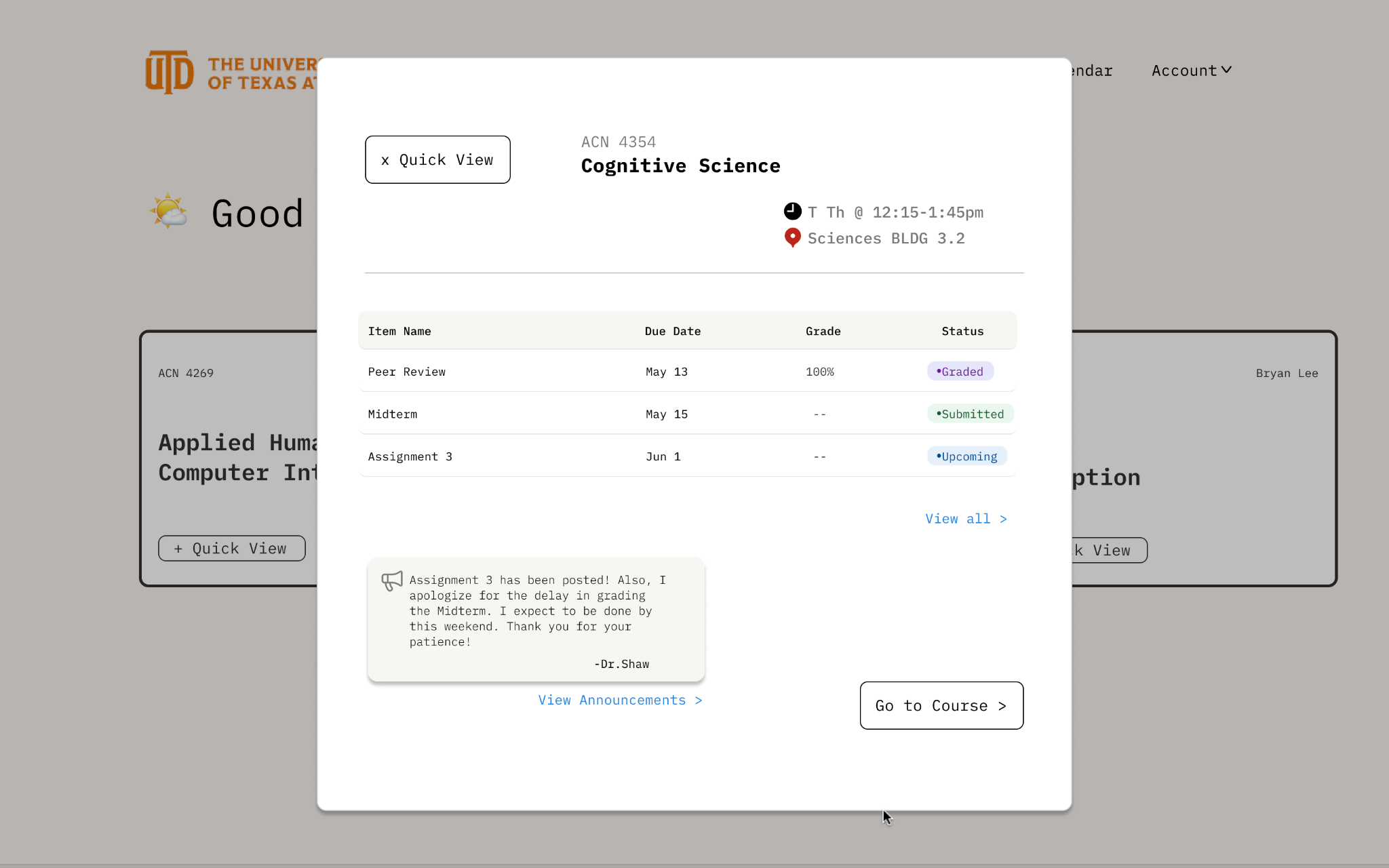
A single click from the homepage opens a lightweight “Quick View” showing course details, announcements, recent assignments, and their status (graded, submitted, upcoming, etc.). Students can check progress and jump straight to the course or grades page — reducing clicks to grades from 4+ to just 2.
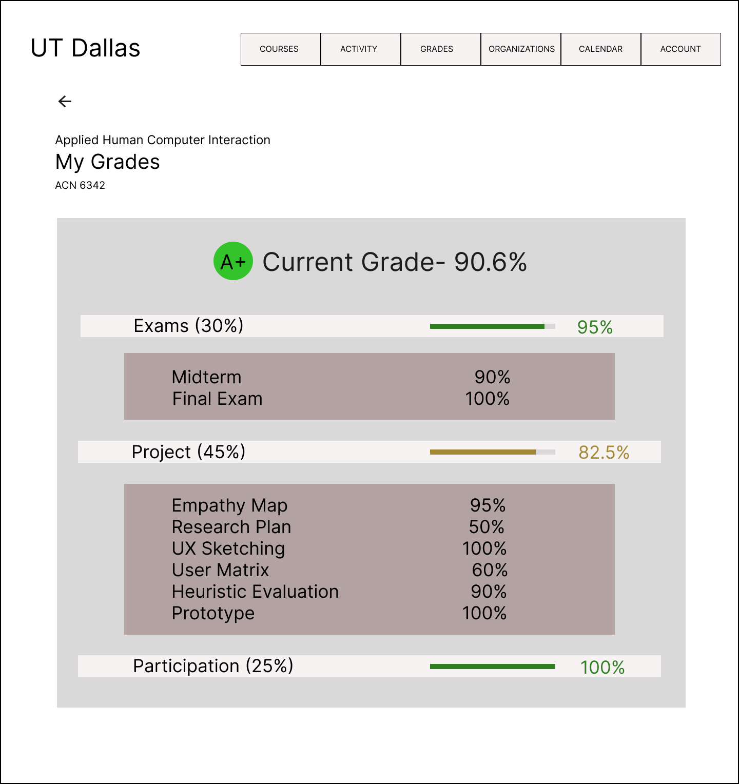
Quick View Modal — Grades at a Glance
Progress bars visualize performance across exams, projects, and participation at a glance. Tabs separate items by category, while each row is clickable for quick access to details. A primary button at the top connects directly to the all-courses grades view, making navigation seamless and intuitive.
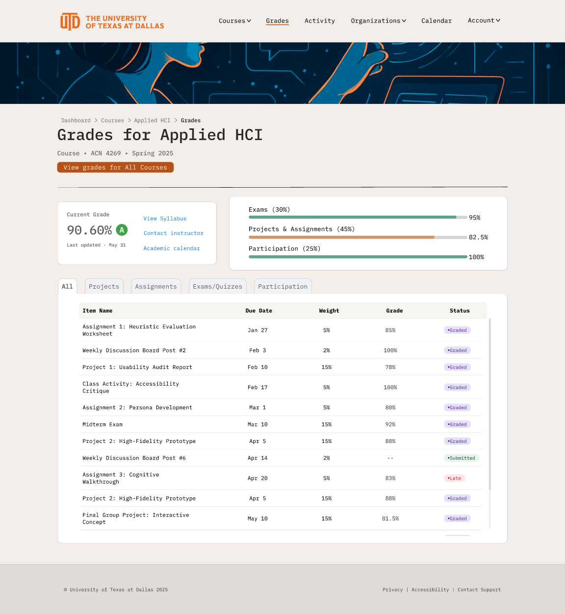
Individual Course Grades — Clear Hierarchy & Interactive Filtering
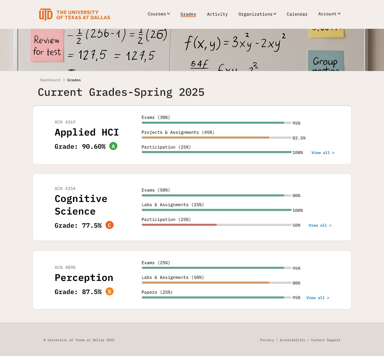
Students can now scan performance across all enrolled courses in a single view. Progress bars make comparisons effortless, while “View all” links enable seamless navigation to each course’s detailed grades page — reducing time spent searching and improving overall clarity.
All Courses Overview — Grades at a Glance Across the Semester
Next Steps
Building on the success of the redesigned flow, the next phase will focus on validation, personalization, and intelligent support for students.
Summative Usability Testing
Conduct a large-scale usability study to validate the high-fidelity prototype and measure key metrics such as time-to-grade, task success, and satisfaction (SEQ).
2. Personalization Features
Explore ways to make the platform more customizable, similar to Notion, by allowing students to:
Choose which widgets appear in their Quick View modal
Sort coursework breakdowns by due date, status, or grade weight
3. Conversational Assistant — “Comet AI”
Design an integrated chat experience where students can ask questions about grades, deadlines, or course details. Comet AI would serve as a smart guide to reduce confusion and make eLearning feel more interactive and human.
These next steps aim to evolve eLearning into a more adaptive, student-centered experience—one that not only simplifies academic management but also supports students proactively through personalization and intelligent assistance.
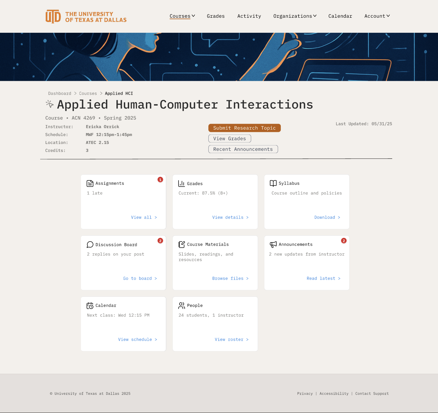
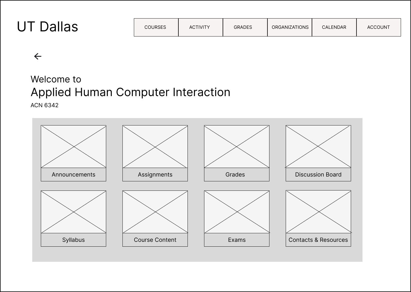
Course Page — Clear Hierarchy & Actionable Navigation
A structured layout prioritizes essential course information and actions. Dynamic primary buttons adapt to context (e.g., submitting assignments or viewing grades), while clearly labeled tiles guide students to key areas. Notification badges surface critical updates like new grades or late submissions at a glance.